How to explain a product on its website
What to say, what to show and in what order, so someone can understand your product and decide whether it fits their needs.
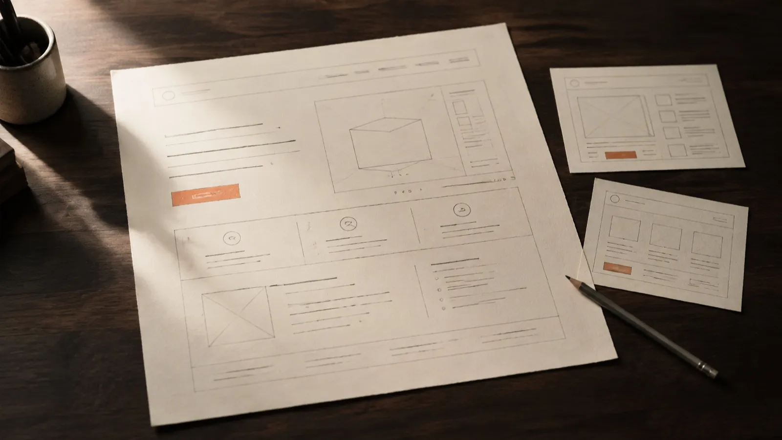
Someone arriving at a product website was not in the meetings where it was defined. They do not know the internal names for its features or why a particular technology was chosen. They may have several tabs open and a fairly straightforward question: “Is this useful to me?”
I would start designing the page around the information they need to answer that question. Content order is a central part of design. It determines what someone understands first, which connections they have to make and how much work we leave them to do.
Start by giving people their bearings
The first screen should help someone recognize what the product is, who it makes sense for and what it helps them do. There is no need to compress the entire company into one memorable line. There is room for a headline, a short explanation and an action.
Take a fictional booking tool for small yoga studios. “The future of connected wellness” leaves too many questions open. A more concrete starting point would be:
Class bookings for yoga studios. Students choose a time and book their place. You manage class capacity from one calendar.
The explanation still needs to express the product’s personality. But it already gives us something specific to discuss: whether this is the priority audience, whether the feature exists and whether the benefit matters. A generic headline makes even the copy itself harder to evaluate.
Show a complete task
Once visitors know where they are, I would show the product handling a recognizable task. In our example, a student chooses a class, checks availability and confirms a booking. The studio sees the updated capacity.
A screenshot can work if people know what to look at. Crop it deliberately and add a sentence explaining the action. An entire screen shrunk until its text is unreadable provides atmosphere more than a demonstration.
For a longer process, a short sequence may work better. Label demonstration data as such. If the interface is still a prototype, say so too. The image should help someone understand the product as it currently stands.
Turn features into answers
A feature list often reflects how a team divides development work. Visitors need to relate those features to their own tasks. “Capacity management” could become “Set the number of places in each class and stop accepting bookings when it is full,” provided that is how the product actually behaves.
I would not remove every technical term. Some are necessary to compare options or confirm compatibility. Put them where they answer a question, with enough detail for the person who needs it.
For the booking tool, I would organize the rest of the page around specific questions: how the calendar is configured, what the student receives, and how a booking is changed or canceled. That sequence explains more than six cards with interchangeable adjectives.
Explain what getting started involves
Price is part of the decision. Setup time, data migration, integrations and available help matter too. A page that avoids these questions can generate interest while leaving the real obstacle untouched until the first conversation.
If pricing depends on scope, explain what determines it and how a proposal is prepared. If someone can start without a meeting, tell them what they need to have ready. Either way, be clear about what the next step includes.
For the yoga studio, knowing whether each class must be entered manually or whether an existing calendar can be imported may matter more than another description of the dashboard.
Ask for a proportionate next step
The call to action should match the decision someone is ready to make. A product requiring implementation and a quote may call for a demonstration. A tool that can be tried without assistance may invite someone to create an account.
The button should anticipate what happens. “Watch a demo” should lead to a demonstration. If the action is booking one, say that. Opening an unexplained sales form introduces a small break in trust just as someone decides to proceed.
You can offer an alternative for someone still evaluating, such as a product walkthrough. I would keep the visual priority clear so every section does not become a competition between buttons.
Test the explanation outside the team
Before calling the page finished, I would show it to people resembling the intended audience who have not been involved in the project. Ask them what they think the product does, when they would use it and what they expect to happen when they select the main button.
I would avoid explaining as they browse. That assistance covers up precisely the gaps I need to find. If someone interprets something differently, record their words and where the confusion appeared.
I would also review the experience on a phone: reading order, screenshot text size, visible links, image loading and how easy it is to complete the form. A well-written explanation can still get lost in its presentation.
Make the page maintainable
The website needs to remain accurate as the product changes. I would assign responsibility for reviewing prices, screenshots, integrations and promises. A feature removed from the interface but still advertised on the page creates a problem no visual adjustment can fix.
If deciding what comes first is difficult, return to the communication definition. If every section feels like it belongs to a different company, revisit the brand criteria connecting the pieces.
My work connects those decisions to design and implementation. If your product needs a website that explains it better, we can start by reviewing what visitors need to understand.