When a website redesign makes sense
Before changing the appearance, understand what has stopped working, what still helps and which outcome needs to improve.
A website can feel old without having stopped working. It can also look polished while making every important task difficult. Age and visual quality tell us something, but they are not enough to justify a redesign.
Before changing it, I would describe the problem using evidence. Perhaps people arrive looking for a service and cannot distinguish between the options. Maybe the team needs several days to publish an update. Or the company has moved toward a different audience while the home page still explains the previous offer.
Each situation might justify a redesign, but not necessarily the same one. The useful question is not only “Should we build a new website?” It is “Which outcome needs to change, and what part of the system is preventing it?”
Start with signals, not a solution
“It looks dated” is a valid perception, but it is still too broad to define the work. I would ask what creates that impression and what consequence it has. Difficult typography, a structure built around an offer that no longer exists, and a style that no longer represents the business are different problems.
I would look for signals in four places:
- What people cannot find or understand, and where they leave.
- What the team avoids updating because the process is slow or fragile.
- What sales and support repeatedly have to explain.
- What the business promises today that the website does not yet reflect.
A drop in enquiries also deserves attention, but it does not prove that design is the cause. Demand, traffic sources, pricing or the quality of visitors may have changed. Compare periods and review the context before attributing everything to the interface.
Separate content, experience and technology
Many projects begin by mixing three layers. Content determines what is explained and what evidence supports it. Experience organizes that content so someone can orient themselves and act. Technology makes it possible to publish, discover and maintain the site with reasonable performance and security.
The layers affect each other, but they do not always fail together. If the offer is described in internal language, changing the grid will not clarify it. If the content is useful but buried under confusing navigation, it may not need rewriting. If every edit breaks a page, the problem may lie in the implementation or content model.
Separating the layers helps set the scope. It also keeps useful material from being discarded simply because it lives inside a website that no longer satisfies the team.
Review complete tasks
I would not evaluate the site one screen at a time. I would follow real journeys: understanding a service, comparing options, finding a case study, requesting a proposal or looking for an answer after buying.
For each journey, I would note what the person needs to know, what information they receive, where they hesitate and what they expect to happen next. This distinguishes a minor annoyance from a meaningful interruption.
I would also inspect what happens after a form is submitted. If the page promises an immediate response and the team takes a week, the problem does not end at the confirmation screen. A redesign can set a clearer expectation, but the experience depends on the operation being able to meet it.
Quantitative data helps locate changes and exits. Conversations, short usability sessions and support enquiries help explain why they happen. Neither source tells the whole story on its own.
Decide what to keep
Redesigning does not require starting over. A familiar structure, a page attracting relevant search traffic, a useful article archive or an effective way of presenting case studies may still have value.
I would make a simple inventory: keep, correct, remove or investigate. The final category matters. When something is uncertain, looking for evidence is better than treating the team’s discomfort as proof that it does not work.

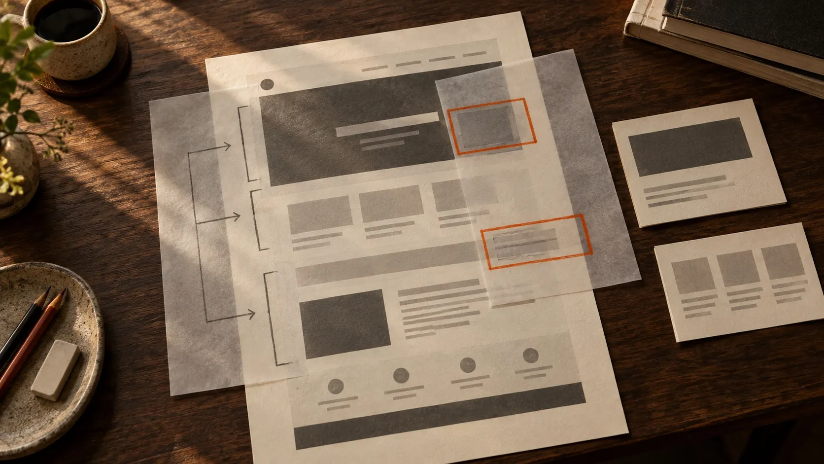
Keep, correct, remove or investigate: the inventory avoids treating everything already there as a single problem.
Keeping useful parts also reduces risk. Changing addresses without planned redirects can lose traffic and break links. Replacing familiar terms with more original names can make navigation harder. Removing content because it does not fit the new composition can leave buying questions unanswered.
A new visual identity may require broad changes, but even then it helps to separate what needs new expression from what already supports people.
Define a measure of improvement
Before designing, I would agree on how to recognize a better outcome. The measure depends on the problem: more people find the right service, the team publishes without technical help, enquiries arrive with better information, or a task is completed with fewer errors.
Not everything needs to become a conversion rate. For a low-traffic website, five carefully observed sessions and an organized record of enquiries can provide more insight than a dashboard full of unstable percentages.
What matters is keeping a baseline. Without a record of the current state, examples of enquiries, publishing times or comparable data, it will be difficult to separate real improvement from the excitement of launching something new.
Match the scope to the problem
Some situations call for a rebuild: the offer has changed, the architecture no longer follows the business and the technical foundation gets in the way of maintenance. Others are better solved through a focused intervention: reorganizing the home page, revising the message, improving a form or creating consistent templates.
Starting with one part does not mean settling. It can be a responsible way to test the direction before extending it. If the priority problem is that no one understands the service, resolving that explanation creates a practical foundation for the rest.
I would also establish boundaries. Which content is included, which integrations remain, who approves decisions and what the team will need to do after launch. A redesign without clear ownership can become outdated again very quickly.
Launch is not the end
A new website needs an initial review using real devices, slow connections, forms, analytics, metadata, redirects and keyboard navigation. Then it needs observation.
During the first weeks, I would record errors, searches, questions and differences between what we expected and what happens. I would not change direction for every isolated comment, but I would not wait months to fix an obvious difficulty either.
A redesign is useful when it turns an imprecise situation into a clearer, more maintainable system. Appearance is part of that change, but it should not hide the central decision: what needs to work better for people and for the team.
If the problem is explaining the offer, begin with how to plan communication for a startup. If the structure of a product page is the priority, continue with how to explain a product on its website.
If you are considering a redesign, we can first review what is worth keeping, correcting or building. That diagnosis often saves work and gives the project a more precise direction.